

Mastering Gradients: A Complete Gradient Color Picker Tutorial
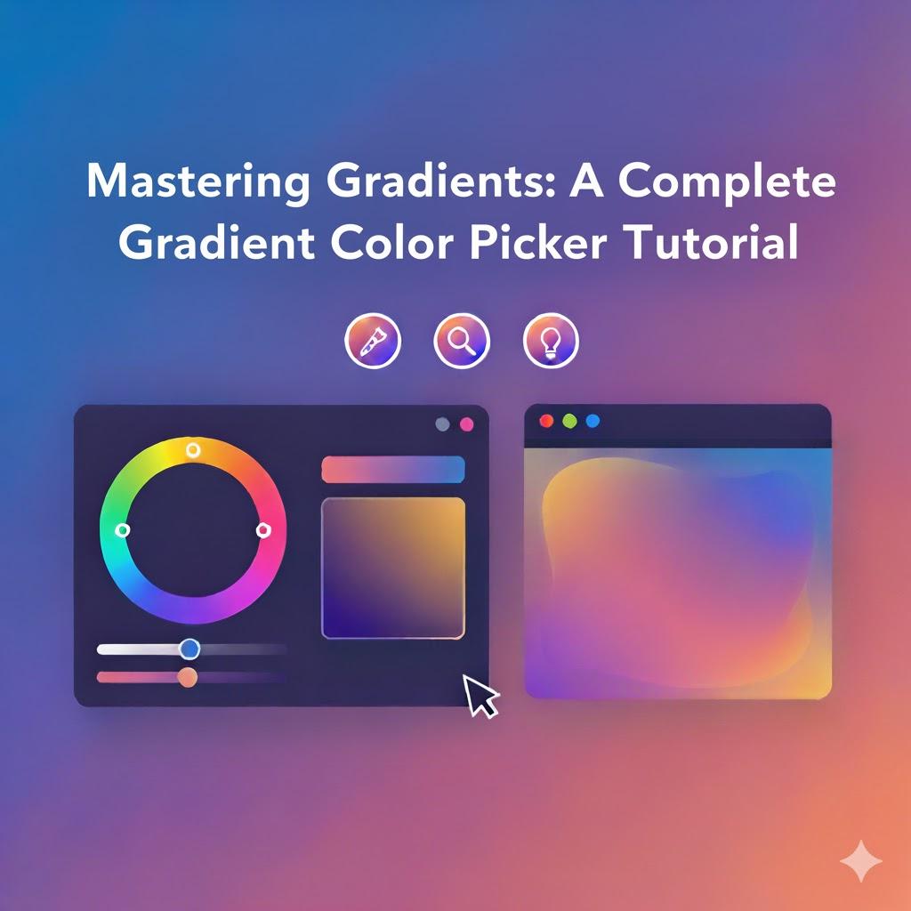
Color is one of the most powerful tools in digital design, and gradients take that power to the next level. Instead of using flat shades, gradients create smooth transitions that give your visuals depth and emotion. Whether you’re designing a webpage, a mobile UI, or promotional graphics, mastering gradients is essential for achieving a modern and engaging aesthetic. And the simplest way to start is by using a gradient color picker — an interactive tool that helps you select and fine-tune professional gradient blends with ease. You can test one here: gradient color picker.
This complete tutorial will walk you through the foundations of gradients, how to build them effectively, where to use them, and smart tips to ensure your designs stand out while maintaining accessibility and performance. Let’s turn color transitions into creative mastery.
Why Gradients Are Essential in Modern Design
Today’s digital environment is visually competitive. Users are more likely to stay on and engage with platforms that look polished and intentional. Gradients provide:
-
Depth without clutter
-
Focus without distraction
-
Emotion without overwhelming users
-
Modern style without complexity
Instead of adding shadows or images, gradients give subtle 3D vibes with simple color play. That’s why top-tier brands, social platforms, and mobile apps are leaning into gradient aesthetics like never before.
Gradients blur the line between art and interface — and that’s what users love.
The Basic Anatomy of a Gradient
If you’re going to build gradients with confidence, you need to understand the structure behind them.
A gradient includes:
-
Color Stops: The exact points where one color changes into another
-
Direction/Angle: Controls how the color travels across the design
-
Opacity: Determines transparency and blending strength
-
Type of Gradient: Linear, radial, conic, mesh, etc.
Each component changes the mood and purpose of your visual.
Types of Gradients You’ll Use Most Often
Linear Gradients
Smooth transitions between colors horizontally, vertically, or diagonally.
Perfect for:
-
Buttons
-
Background strips
-
Product cards
Radial Gradients
Colors spread outward from a center point, like a spotlight.
Perfect for:
-
Hero sections
-
Highlights behind icons
-
App splash screens
Conic Gradients
Rotating color transitions around a center point.
Perfect for:
-
Dynamic charts
-
Spinners and loaders
-
Futuristic UI components
Mesh Gradients
Multiple colors blended abstractly — more artistic and versatile.
Perfect for:
-
Landing page banners
-
Creative brand visuals
-
Presentation backgrounds
Each type serves a different emotional and functional goal.
How to Use a Gradient Color Picker — Step-by-Step Tutorial
Below is a simple but detailed tutorial that anyone can follow:
Step 1: Choose Your Primary Color Emotion
Start with what your brand or message needs to express:
| Emotion | Suggested Colors | Use Case |
|---|---|---|
| Trust | Blues, purples | SaaS, Finance |
| Excitement | Reds, oranges | Marketing, Retail |
| Creativity | Pinks, violets | Art, Cosmetics |
| Balance | Greens, teals | Wellness, Nature |
📝 Color psychology leads better UX decisions.
Step 2: Add a Supporting Shade
Use a secondary color to enhance the visual purpose:
-
A lighter shade for brightness
-
A darker tone for depth
-
A complementary color for contrast
-
A neighboring color for smooth harmony
📌 Limit yourself to 2–3 colors to avoid a messy gradient.
Step 3: Adjust the Gradient Direction
The angle determines how the viewer engages with the visual:
| Direction | Visual Effect |
|---|---|
| Horizontal | Calm and balanced |
| Vertical | Hierarchy and structure |
| Diagonal | Motion and focus |
| Circular/Radial | Central highlight |
Direction is a storytelling tool. Use it wisely.
Step 4: Set the Opacity and Smoothing
Opacity lets you:
-
Add layering to designs
-
Make backgrounds subtle
-
Improve readability behind text
A smooth gradient is never sharp or distracting.
Step 5: Test Readability and Accessibility
Beautiful means nothing if users can’t read or navigate.
Check:
-
Dark mode compatibility
-
WCAG contrast requirements
-
Device differences (mobile, tablets, HDR screens)
Accessibility builds trust — and trust drives conversions.
Expert UI/UX Tips to Level Up Your Gradient Skills
These principles are based on professional experience — letting you show expertise through smarter design:
Focus Gradients on Key Interactive Elements
Gradients shine most when guiding attention:
✔ Buttons
✔ CTAs
✔ Form fields
✔ Navigation highlights
They should complement the layout, not dominate it.
Keep Performance in Mind
CSS gradients are:
-
Lightweight
-
Resolution-independent
-
Faster to load
Avoid heavy image gradients to protect site speed.
Maintain Brand Consistency
Your gradient style should follow a repeatable design system:
-
Color palette restrictions
-
Reusable direction rules
-
Consistent opacity ranges
Consistency = authority and recognition.
Prioritize Harmony Over Drama
Trendy doesn’t mean chaotic.
Use careful blending to match:
-
Industry vibe
-
Brand personality
-
User expectations
Design that feels forced loses credibility.
Best Places to Use Gradients in Web and App Design
| UI Component | Benefits |
|---|---|
| Hero Banners | Immediate emotional impact |
| Cards & Tiles | Better organization and appeal |
| Buttons & CTAs | Higher click-through rates |
| Loading Screens | Better perceived wait time |
| Icons & Logos | Stronger brand recall |
| Pricing Sections | Conversion-focused hierarchy |
With gradients, simplicity becomes “wow.”
Common Gradient Mistakes to Avoid
To appear professional:
-
❌ Don’t combine too many colors
-
❌ Don’t put noisy gradients behind small text
-
❌ Don’t use low-contrast transitions
-
❌ Don’t forget dark-mode variations
-
❌ Don’t let gradients overpower content
The best gradients feel intentional, not experimental.
Advanced Techniques for Future-Ready Designers
As digital experiences evolve, so must your design skills. Try:
Animated Gradients
Moving color transitions create an immersive modern vibe.
Glassmorphism
Soft gradient transparency with a frosted-glass effect.
3D Illusion Gradients
Depth-enhancing angles for high-impact sections.
Mesh Gradient Artwork
Perfect for artistic, abstract layouts.
Emerging interfaces like AR/VR will rely even more on gradients — mastering them now sets you apart.
EEAT in Gradient Design: What It Means for You
Experience
Real-world understanding of color impact
Expertise
Command of gradients across UI/UX elements
Authority
Consistent styling representing strong design identity
Trustworthiness
Readable and inclusive visuals that respect every user
Good gradients prove you care about both beauty and usability.
Performance, SEO, and Brand Results — The Hidden Wins
Gradients help you boost:
-
Engagement metrics
-
Brand perception
-
Conversion-focused interactions
-
User retention
-
Search relevance via UX signals
Design that performs well is marketing on autopilot.
Conclusion: Gradients Unlock Creative Possibilities
Mastering gradients isn’t about just adding color — it’s about creating fluid, meaningful transitions that shape user experience. With a professional gradient color picker, you can:
✔ Build stunning visuals faster
✔ Enhance UI and strengthen the brand voice
✔ Keep everything readable, accessible, and modern
✔ Maintain site performance and trustworthiness
✔ Stay ahead of design trends
✨ Blending colors is blending emotions.
✨ Every gradient tells a story — make sure yours speaks boldly and clearly.
Whether you’re a beginner or growing your design expertise, this tutorial equips you with the foundation to confidently create gradients that attract, guide, and impress users.
 English
 Arabic
 French
 Portuguese
 Deutsch
 Turkish
 Dutch
Dutch
 Italiano
 Russian
 Romaian
 Portuguese (Brazil)
 Greek
Greek