Understanding the UX Design Process: A Complete Guide from Research to Final Product
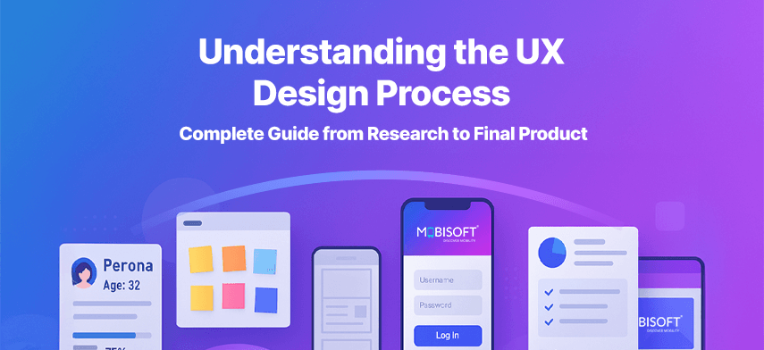
How to go from “I have an idea” to “Users actually love it”
Building an application is not easy. It can feel like assembling a puzzle without knowing the final look. It used to be easy, but now with the advent of AI, increasing competition, and growing user expectations, it requires extensive planning and research to be successful.
Enter the UX design process. It’s not just some creative fluff your designer talks about during meetings. It’s the behind-the-scenes work that makes apps intuitive, websites enjoyable, and products not painful.
Here’s a clear, step-by-step breakdown of the UX/UI design process. No jargon. No fluff. Just real talk about how to go from an idea to a usable, lovable product. Curious to see how the full UX design process shapes great products? Explore it here.
1. UX Research: Stop Guessing, Start Asking
Before you sketch a wireframe or even pick a font, take a deep breath and do your research.
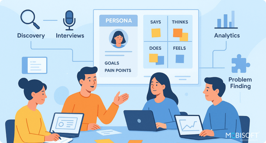
The UX research process is about asking the right questions before writing a single line of code. You’re trying to figure out what your users really want, not what you think they want.
What You Should Be Doing:
- User Interviews: Talk to real people. Yes, actual humans. Ask how they currently solve the problem your product aims to fix.
- Surveys: Great when you want data from a large crowd but don’t have the time to chat one-on-one.
- Usability Testing: Give someone a task and observe what they do. Spoiler: It’s rarely what you expect.
- Analytics Review: Look at behavior on your current platform. Where do users drop off? What pages do they hate?
Example: A team spent three weeks designing a fancy multi-step sign-up flow. Then they did research and realized users just wanted a “Continue with Google” button. Oops.
Looking to strengthen your research process? Explore our UX audit services.
2. Define the Problem: Be Ruthlessly Clear
Once you’ve collected all that lovely data, it’s time to make sense of it. Defining the problem means distilling everything into a simple, sharp statement.
You’re not building for everyone. You’re solving one clear problem for one kind of user.
What You Need:
- Problem Statements: Write down the core issue users face. Keep it simple. If it sounds like a TED Talk title, you’ve gone too far.
- User Personas: These are not characters in a Marvel movie. They’re realistic profiles based on your research — people with goals, frustrations, and quirks.
- Customer Journey Maps: Visualize the user’s steps, emotions, and pain points across the experience. Think of it as stalking, but in a legal and helpful way.
Example: A food app realized they were designing for fitness junkies, but their real users were busy parents who just wanted dinner in 10 minutes. That changed everything.
Need expert help with product journey mapping? Check out our web UX design services.
3. Ideation: Get Silly Before You Get Serious
This is the part where anything goes. You’re not here to be perfect. You’re here to throw spaghetti at the wall and see what sticks.
What Works:
- Crazy 8s: Fold a paper into 8 boxes. Sketch 8 different ideas in 8 minutes. It’s fast, chaotic, and surprisingly brilliant.
- User Story Mapping: Map out the user’s journey and the features they need at each step.
- “How Might We” Questions: Ask things like “How might we make onboarding so easy a toddler could do it?”
Example: A grocery delivery app team asked, “How might we help users shop in under 2 minutes?” That led to a feature that suggests meals and adds all ingredients to the cart. Boom. Time saved.
Learn more about scaling ideation with DesignOps benefits.
4. Wireframing: It’s Ugly for a Reason
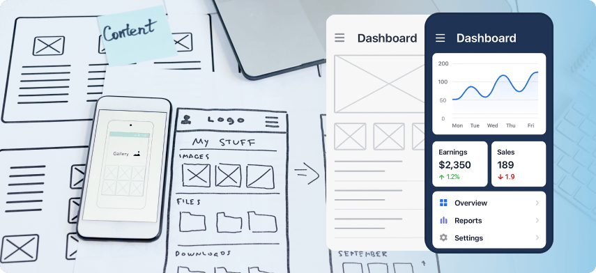
Now that you have ideas, sketch them out. Wireframing in UX is like creating blueprints. They show where stuff goes, how pages connect, and what users can do.
No color. No gradients. No drop shadows. Just boxes and lines.
Tools You Can Use:
- Figma
- Balsamiq
- Sketch
- Pen and paper (yep, that still works)
Example: One SaaS team used wireframes to test three versions of their dashboard layout. The most boring-looking one worked best. Users said it “just made sense.”
Looking for guidance on structure and flow? Explore our mobile UX design services.
5. Prototyping: Fake It Till You Make It
A UX prototype is a clickable version of your product that looks real, but doesn’t work under the hood. It’s like a movie set: convincing, but hollow.
Use this stage of the UX design workflow to test flows, gather feedback, and spot issues before your dev team writes a single line of code.
Benefits:
- You see how people actually interact with your design
- You avoid wasting time building features no one uses
- Stakeholders love something they can click on
Example: A fintech app made a prototype of their onboarding flow. Turns out, users hated setting financial goals upfront. The team changed the flow before wasting two sprints building it.
Improve your prototype validation with our insights on mobile app UX best practices.
6. Usability Testing: Watch. Don’t Talk.
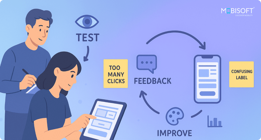
This is where the truth hurts (in a good way)
Put your prototype in front of users and let them use it. Don’t help them. Don’t explain. Just watch. Where they get confused, that’s where you need to fix things.
What to Watch:
- Where do users hesitate?
- Are they clicking the wrong buttons?
- Do they complete the task or give up?
Example: A health app had a “Track My Water” button. Testers kept clicking the giant “Glass of Water” image instead. The solution? Make the image tappable too. Easy win.
Learn how AI-driven tools can refine usability with AI in UX design.
7. UI Design: Now Make It Pretty (But Smart)
Finally, The part everyone thinks user experience design is all about.
UI design is where colors, typography, spacing, and visual hierarchy come in. But it’s not about making it pretty. It’s about making it work while looking good.
Key Elements:
- Consistency: Buttons should look like buttons. Everywhere.
- Accessibility: Make it usable for people with different abilities.
- Responsiveness: It should work on desktop, tablet, mobile, and your uncle’s weirdly small laptop.
Example: A booking app reduced bounce rates by 15% just by increasing contrast and using larger fonts on mobile. No fancy animations, just clarity.
Read More: https://mobisoftinfotech.com/resources/blog/ui-ux-design/ux-design-process-guide
- AI
- Vitamins
- Health
- Admin/office jobs
- News
- Art
- Causes
- Crafts
- Dance
- Drinks
- Film
- Fitness
- Food
- Oyunlar
- Gardening
- Health
- Home
- Literature
- Music
- Networking
- Other
- Party
- Religion
- Shopping
- Sports
- Theater
- Wellness

